
When I started this list, I wondered if I had a total of ten further complaints. Well. See list. They mostly have to do with inaccuracies started by Disney, but there are a few problems I commonly see that come purely from the artists' heads.
- James's hook on the wrong hand.
- The Jolly Roger as the wrong kind of ship. It's a brig. It has two masts. It's in the book.
- Skull Island. If the artists can't hear the Copyright Gestapo approaching, I can.
- Nana as a St. Bernard. Nana is a Newfoundland. Again, it's in the book. It's not hard to look up.
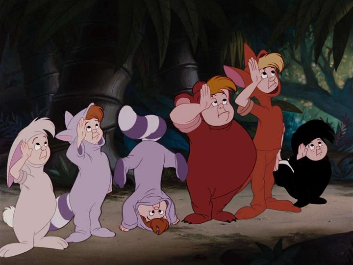
- Ugly lost boys.What gives? Disney!Wendy really wanted to be a mother, I guess.
- Most depictions of Tiger Lily and her tribe because they skirt (if not dance in the middle of) being ignorant and even offensive.
- Mermaids with bra tops. A tail is not a skirt. This is the equivalent of cartoon characters who wear shirts without pants.
- James with eyes any color other than forget-me-not blue, or red if he's in the middle of being angry.
- Teenage Peter and Wendy. Very popular. Very much not the point at all.
- Most updated versions. It seems like this should be easy to pull off, but they usually end up looking like a committee sat in a room debating what kids these days are into.
I see a lot of Peter Pan art. I have over 200 images on my desktop wallpaper as inspiration, most of them of James Hook, naturally, but others depicting other characters in Peter Pan, or ships, or landscapes that make me think of Neverland or Edwardian England. So I have developed some strong notions of what I like and don't. I confess now that some of my saved art contains elements from my list, but I like it well enough for other reasons to save it anyway. That doesn't mean I don't notice!
No comments:
Post a Comment